
Grow NYC - A Re-design
PROJECT OVERVIEW
As New York City locals, we personally feel the challenges of trying to live greener, healthier lives in this city. We want to understand other locals’ thought process in regards to living more environmentally friendly in NYC. How they go/or how they believe they can go about living “greener” day-to-day life.
For this project, our objective was to choose a non-profit organization to re-design. GrowNYC.org was originally designed to educate New Yorkers on how to live a greener healthy lifestyle, while also providing helpful resources. Our observations showed the website design is outdated with an inefficient layout, that was not meeting our expectations. There is a disinterest and a lot of frustration when navigating the site.
My Role/Responsibilities
Project management, user interviews and testing, wireframing, UX/UI design, accessibility, and prototyping.
Two Weeks, Team of 4
Tools
Figma, Google Survey
Timeline
The Goal
How can we redesign GrowNYC’s website to bring in more interest while making it more accessible for new and existing visitors.
Strategies
Creating wireframes, prototypes, interactions, and high fidelity web and mobile designs based on our research and goals.
Research & What it means
Our research used Google Surveys and interviews to gather both qualitative and quantitative data. This helped us understand our target audience, specifically NYC locals who are interested in volunteering and buying local food. The survey reached a wide range of people, and the interviews gave us detailed insights. Through data analysis, we found patterns and trends that guided our recommendations for improving the Grow NYC website. This helped us understand what our users want.
Using the information from the interviews and survey, we created an affinity diagram to identify common themes. Our analysis showed that the main challenges of living a sustainable lifestyle in NYC are a lack of education, financial resources, and accessibility. While many respondents appreciate the city's walkability and see it as environmentally friendly, most agreed that NYC needs better infrastructure to fully support environmentally conscious choices. We will use these findings to guide the redesign of the Grow NYC website.

Major roadblocks are Accessibility 26.7%, Budget and Lack of knowledge.
93.3% of NEW YORKERS have done volunteer work and 60% are environmentally conscious


Research Methods
During our in person interviews, we were able to ask follow up questions, this allowed us to watch their body language, how their personal emotions came into play. This gave me key insight to our users’ needs.
Interviews
Surveys
Reworking some of our interview questions into our survey, we were able to reach a larger audience. Many of our users stated they have a big interest in becoming environmentally conscious, however there was a lack of educational resources on how to implement it.
User Testing
Throughout the design process, we actively sought out input and involvement from our users, valuing their perspectives every step of the way. From initial concept sketches on paper to the creation of multiple prototypes, we consistently incorporated user feedback into our decision-making. By relying on this iterative method and leveraging data-driven insights, we honed in on ways to enhance user interactions with our product, allowing us to make intelligent and informed design choices.
Personas


Heuristics Evaluation
We learned early on there was a big disconnect between what the website wanted to say and what users were seeing. There was no clear direction and users felt overwhelmed.
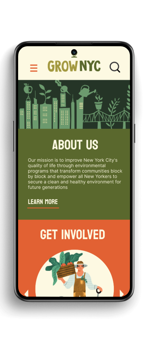
The original websites navigation had a multitude of drop-downs, making it look cluttered and overwhelming. Multiple redundant pages within each dropdown. The overall page was lackluster, which we felt we needed to breath some life back into. We knew we wanted it to feel greener and welcoming when you first looked at it. Our main goals were to make the navigation easier to navigate for all and prioritize what was essential to our target users. We wanted to make sure there was consistency throughout - colors and style.


Competitors Analysis

My team and I compiled a list of nonprofit organizations that share similar views with GrownNYC. What were the strength and weaknesses of of each website we evaluated. This allowed us to identify specific key features we intended to incorporate into the new redesign, while also avoiding any pitfalls we uncovered during our initial evaluation. It was quite clear that our competitors had a modern interface and straightforward and simple navigation.
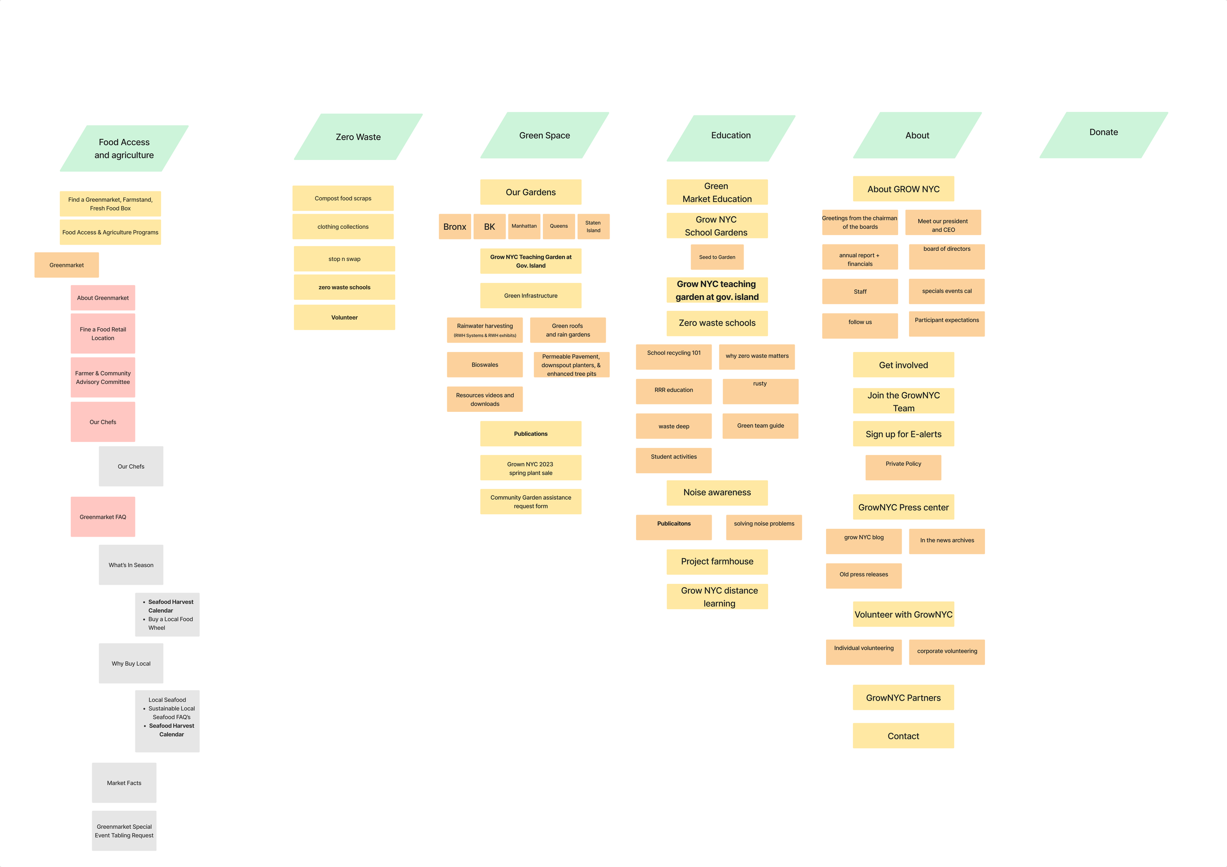
Card Sorting & User Flow
One main problem we found with GrowNYC's current website was the overly complex menu. To fix this, we used card sorting to help us come up with a new, user-friendly structure. After finishing the card sorting, we created a user flow that incorporated our new menu design.

Wireframe & Lo-Fi Prototype

Style Tile
For our color scheme, we wanted nature to be the theme. our main colors were greens, yellows, and orange. We found stock illustrations that fit our re-designs new look and feel. Our fonts we wanted something a bit playful and bold.
